We were in Menards earlier this week, looking at light fixtures, and realized that we couldn't quite remember the lighting situation in one of our rooms. Now Menards is a full hour from our house, so we didn't want to make a return trip. So Josh whipped out his iPhone (also known was the iWife around here) and quickly pulled up some old house pictures we'd put on our Picasa page. I have to admit, the iWife is pretty handy.
Our answer was quickly found, and we purchased the correct light.
While we were standing in the store, looking at these pictures, the same thought occurred to us:
Wow, it doesn't even look like the same place.
One of the biggest reason it looks so different? The paint.
When we bought this place it was bare. Stark. Blah. There was virtually no color to be found. We didn't find this to be a problem, because white walls are especially easy to paint over. And paint we did. Our parents helped tremendously, and we were able to knock a lot of out it in the first couple of weeks. After a couple months, we're still happy with our choices.
It took us a long time (including several arguments and trial runs) to decide on the colors. I vividly remember those days.
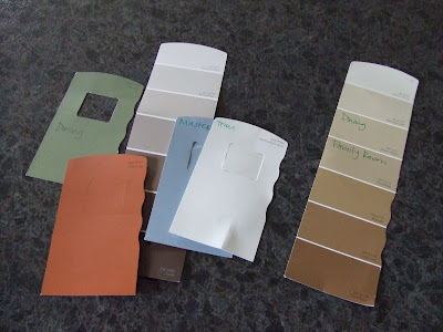
Anyone need a sample of tans, browns, or greens? You know where to come. They're still in our garage.

So, in case anyone is curious, I'll list the colors we chose. (And really, half of the reason I'm posting this is because I'd like to be able to check back and reference this later on.)
Living Room:
Sherwin Williams 6219 Rain

Dining Room:
Upper - Sherwin Williams 6121 Whole Wheat
Lower - Sherwin Williams 7729 Edamame

Kitchen/Eating Area:
Benjamin Moore 488 Mountain Lane (and thankfully a new light fixture arrived today for this space)

Family Room:
Sherwin Williams 6122 Camelback (one of the hardest ones for us to get right)

Our bedroom:
Mostly - Sherwin Williams 7601 Dockside Blue
Accent Wall - Sherwin Williams 6082 Cobble Brown

Guest bedroom:
Sherwin Williams 7703 Earthen Jug (Josh's pick)

My office:
Sherwin Williams 6765 Spa (my pick! and I'll be decorating with orange one of these days)

Trim/Ceiling:
Sherwin Williams 7566 Westhighland White
You can see it in the living room, dining room, and family room, and it is one of my favorites. White with the slightest hint of cream. We painted miles of dark trim with it, and it made a world of difference.
Yes, there is a Sherwin Williams around the corner from our place. If they were looking for a sales push one weekend, they got it! But we've used that paint in the past and have always been impressed.
So if you're looking for a good paint color, and you like what we've done, go ahead and steal the specifics off this page. For additional paint suggestions, one of my very favorite DIY house blogs posted a very helpful color guide, so head here if you're interested.


6 comments:
The colors look nice, at least what I can see of them in the pics :) Can't wait to see actual room shots!
We have Whole Wheat throughout our entire house practically! And Cobble brown on the accent wall on the fireplace. I love all of your colors! great job!
I love it! You guys have done a great job on the house!
I am glad the iWife is your friend. It is nice when she actually comes in handy. Can't wait to see you on Sat.
i really like all the colors you picked. maybe someday i will reference back to this post!
Your color choices are awesome!!! *I* may have to reference your post again in the future. :o)
Post a Comment