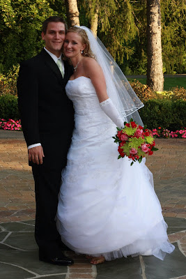
Take this one - beautiful, right? Straight out of the camera:
 But Erin's scrapbook has so much color, maybe it would be fun to throw in a sepia tone...
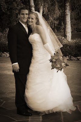 Or a sharper version:
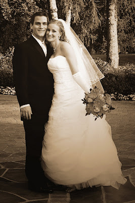 But does her beautiful bouquet look weird with that tone? Should that stay colorful?
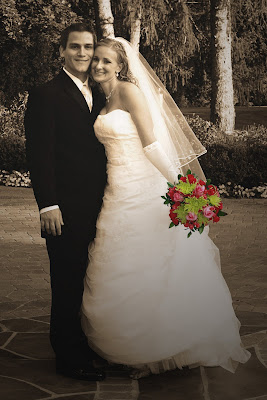 Or maybe that is too much (although it certainly took me awhile to figure out!) It looks weird. Maybe I should scale it back a bit a touch. Is that better?
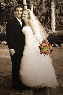 Or should I include just a teensy bit of flower color?
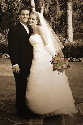 Sigh. Maybe full color (aka the original) is best after all.
What do you think?


6 comments:
I like the sepia one.
I personally like the color one. But then again, I always like those - it takes you back as if you were right there.
i rarely like the "this one thing gets to be in color but everything else is b/w". i feel like there are certain instances where it's ok, but mostly, it's just weird.
i like the sepia.
LK
I like the sepia one the best. It had the "softest" feel. (don't ask me to explain that :) )
I like the sepia tone one too. The one where the bouquet has a little bit of color is OK too, but overall, the sepia tone is the loveliest.
i like the first sepia one.
Post a Comment